Migration Paths (Analyst Edition) app for iPhone and iPad
Developer: Cousins & Sears Creative Technologists
First release : 19 Jul 2014
App size: 14.78 Mb
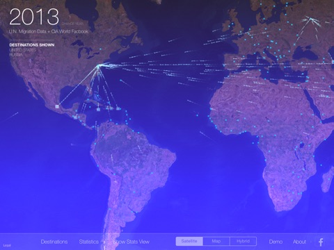
The Migration Paths App is a visualization of human migration where static data comes alive as kaleidoscopic parades of global activity.
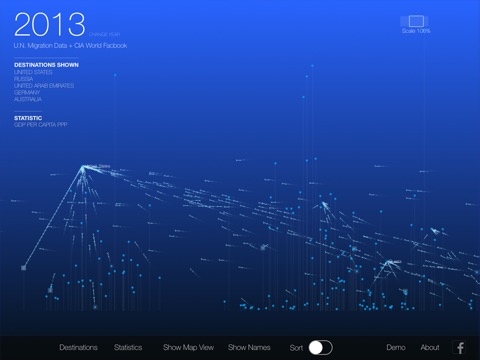
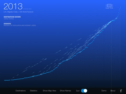
Using a breathtaking and breakthrough technique for visualizing traffic patterns, this app displays annual migration data from the United Nations in perpetual flows and layers them over maps and statistical graphs of CIA and World Bank data. With this combination you gain insights, generate questions and form new hypotheses about where and why people migrate around the globe.
You’ll answer questions like: Are people migrating to and from certain places because of economic opportunity, technological advantage, lower birth rates, amount of land, or larger urban populations?
You’ll also rapidly interpret large amounts of data from sources that can’t be combined in traditional visualizations, so conclusions that normally come in the form of several dashboards and written summaries happen in a single instant in a single visual. For instance, you can view whether people migrate to a country come from a specific region or from all over the world, while still seeing the volumes of traffic from each individual country of origin.
Download it now and find stories in the data!
Plus, Migration Paths is a great way to jumpstart conversation on world affairs, so try putting it on a big screen for a group of people with Apple TV. Also, reach out to us about putting your data in this app or into an app like it. We currently use the paths technology for visualizing other networks like website traffic and data form sensors.


